In what ways does your media product use, develop or challenges forms and conventions of real media products?
When doing my research and planning in preparation for the production area of my music magazine, I researched the conventions of a music magazine. I labelled the conventions of a VIBE magazine front cover, analysed three rolling stones front covers, then analysed the front cover, contents page and double page spread of an NME and Q magazine. From this I gained the knowledge of regular magazine conventions, relating to layout, styles and the relevant content. On my front cover I included usual conventions such as the head mast, puffs, anchorage text, a banner and a menu strip featured with a + icon. The text surrounded my central image and in some places I had super imposition where the test and central picture overlap. My main image slightly obstructed the head mast, which is conventional for a popular, recognised magazine, however it challenged the conventions of a new magazine. Newer magazines, generally prefer their title to be seen, so it’s name becomes recognised which is why I include the title in various places on my magazine, such as; the background of the contents page, by the page numbers and at the top of pages when labelling the magazine section. This will helped the magazine title to be remembered.
I chose a magazine title which has connotations that relate to the genre of my magazine. I first got the idea of the title 'ENTOURAGE' from the song 'entourage' by the R&B singer Omarion. This song includes lyircs such as: 'you’re a star in your own right, at times you steal the whole spotlight' which would reflect on the artists being featured in my magazine. Also, 'entourage' is the name of an American comedy-drama tv series from 2004, and is now in syndication around the world. Due to R&B music being mostly successful, and popular in America, I found that this would make my magazine title more recognisable. The dictionary definition of the word 'entourage' is; "a group of attendants of associates, as of a person or rank or importance", which would represent what my target audience are to the artists and the magazine itself.
I maintained a house style, where the fonts remained similar through the entire magazine. The colour scheme was the same on the front cover and contents page, also it remained similar on the double page spread. My regular colour scheme is black, grey, white and then a bold colour. After experimenting with various colours, I chose an aqua-turquoise for the bold colour featured on my front cover and contents page. However, the main colour on my feature article was pink. This is because it suited the image that I was creating for my main artist.
The layout I used in my magazine is the typical layout conventions of music magazines. My front cover included the usual central image, surrounded by puffs and anchorage text. The contents page shows indication of the regular music magazine page order, such as Feedback/talks/fan mail, News Articles, New Artists, Live Reviews, Feature Articles, Album, Reviews, Listings and Adverts. I also featured a subscription section on the contents page, which is a usual thing to appear in music magazines in order to keep regular customers. The first page of my feature article used an image on the right hand page, another regular convention. However, due to my magazine being new, I had to introduce the article more thoroughly than existing magazines would. The language of my article was addressing the readers as if they were intelligent fans and part of an in-crowd. This is because my artists used would be well-known, which would help my magazine gain more interest from readers. I included the magazine head mast ‘ENTOURAGE’ in various places over my magazine, so it would be something my readers would subconsciously remember.
How does your media product represent particular social groups?
My magazine uses images which stand out and are very eye catching. Standing out and being individual is something, young people strive for today, however, the magazine also provides my target audience idols and role models. People they can admire and inspire to be similar to. The artists featured are all relatively young, so it represents the age group I am aiming my magazine at. The genre of R&B and pop are very common and popular music genres for young people today, so it will reflect them through the type of music it focuses on. The way in which my magazine portrays young people, it challenges the usual negative image that has been associated with young people in the media. This is because the young people in the magazine are shown in a positive light. The fashion element included, shows the keen interest in fashion and symbolises the styles of my target audience.
In the article itself, my artist talks about being with her friends and describes herself as a ‘normal teenager’. This means that teenagers reading my magazine would be able to associate with the artist. Also, I speak to the readers as slightly informed fans, however I do have to give a little background information on my artist in the article introduction as the magazine is new so I cannot assume they are familiar with her. This would attract readers of my target audience to buy the magazine again, as it makes them feel involved and as if their part of an in-crowd.
Due to teenagers being regularly shown in a negative way through the media, i aimed for my ‘teenage’ artist to be represented more positively. This would satisfy teenage readers, and interest more of my younger target audience. Because of this, my magazine would be chosen by teenagers and be more popular for representing them differently to the usual stereotypical view.
What kind of media institution might distribute your media product and why?
I would like the company Bauer Media to distribute my music magazine. As it is a successful, worldwide magazine production company which operates a great variety of magazines. Including both niche and mainstream magazines, so they would possibly be able to make my magazine a mainstream one. They have a lot of best-selling magazine such as ‘Grazia’, which suggests they are very successful. Another reason would be that they also operate or have links with other types of media, such as television, radio channels and websites. This means that they will be able to promote my magazine easily, without too much expense which will automatically increase the popularity of my magazine.
Who would be the audience for your media product?
My target audience is teenagers and young adults, ranging from the age of around 15 to 25year olds. This will make my magazine more successful because I can associate with people of that age, so I can make my magazine more appealing to people of that age. I thought that it would be a more popular magazine with a unisex target population because both male and female participants answered my initial questionnaire, and the music genre I have chosen caters for both genders. Therefore, I aimed my magazine at the younger generation. Even though, a lot of magazines aim at this type of age group, the only real successful R&B magazine is ‘VIBE’ and also it is generally this age group which are interested in music magazines. This is why my magazine is monthly, to make sure it is affordable to my audience, and in my survey the most popular price people were willing to pay is £3.99 however, because my magazine is new I reduced it to £2.99. The type of people my magazine would interest would be generally people from cities and towns, due to them being interested in music, however it would be available to those out of the city.
How did you attract/address your audience?
For my central image, I used a mid-shot of my main feature artist. The image used direct mode of address so the readers were able to see her properly. A mid-shot image enables the body language and posture to be seen, along with the facial expressions. The costume the artist wore would have attracted young people, as would the image as the girl is young and appears to be of that type of music genre. I used a common colour scheme of black and white, as well as a brighter colour. I chose the colour turquoise because it matched the clothing worn by the artist and because it is a bright, unusual colour for music magazines it would attract attention from readers. On the front cover I included notorious names such as Nicki Minaj and Rihanna, this would be something that would gain interest. My head mast ‘ENTOURAGE’ was in black, capital and bold letters in order for it to be clear and noticeable. Also, to emphasise it, I made it stand out but using a shadowed effect on it.On my front cover i included buzz words: ‘EXCLUSIVE CADIE MASON POSTER INSIDE’, this special offer would have been something to gain the attention of more readers. Also, on my contents page I advertised a special offer for subscribing to the magazine.
What have you learnt about technologies from the process of constructing this product?
Throughout the planning and creating of my music magazine, I have learn’t how to use different technologies. Such as photoshop, I am now able to remove the background of a photo by using the magic wand, magic selection or lasoo tool. I can change the quality of an image, by adapting the contrast, sharpness and brightness. I have learnt how to change the hue and saturation of images, so it looks more effective when changing the colour. On adobe illustrator, I learnt how to add shadow effects and feather images. I created the front cover and article pages on illustrator, however I used photoshop for my contents page and made it using different layers. Photoshop gave a lot better quality, however it was more time consuming than creating pages on illustrator. I also learnt how to use a professional digital camera, as I had never used one before. This made my images appear much more professional and realistic. I now find it easier to change text, such as the style, font and colours in order for it to match the page more effectively.
Looking back at your preliminary task, what do you feel you have learnt in the progression from it to the full product?
Even though I used photoshop to slightly edit my images and I created the magazine itself in illustrator, my college magazine was not as good as my music magazine because I had no knowledge of the two programmes. From me learning more about the programmes, I found it easier to do, which prevented it from being as time consuming as my college magazine was completed a lot quicker than my music magazine, however it didn’t look as professional. I learnt skills such as feathering, therefore my photos appeared more attractive after manipulating and editing them. One aspect that majorly increased my progression, was that I learnt the conventions of a music magazine. Therefore, when creating and planning my layout, it suddenly became more professional than my preliminary task. As well as my newly gained knowledge of shot types, frames and angles. I learnt such things as; a low angle makes the subject appear superior, powerful or intimidating, whereas a high angle shows them to be inferior or vulnerable. Close up shots help to show the emotions of the subject, and a long shot concentrates more on their body language, attitude and whole image. Direct mode of address is something used on nearly all magazine front covers, as it gains attention, focus and some sort of trust from the readers. This is why I used a direct image for my front cover, to attract attention off an audience. Other aspects which increase the interest in a magazine are; bright colours, buzz words like ‘EXCLUSIVE’, freebies, exciting anchorage text and puffs, notorious people featured inside, attractive images, the language and attitude of the articles. One final factor I had to consider was the setting of the images, such as the mise en scene and lighting. In my original images I included a guitar, headphones and microphone so the images appeared more musical. Also, the clothing worn by my main artist was used to portray her as a regular teenager, not still a child or trying to be a woman. The lighting of the images has a big effect on the mood of the photo, I tried to keep my lighting looking natural so the focus was more on my artist and opinions towards her would be more honest and not persuaded.

When doing my research and planning in preparation for the production area of my music magazine, I researched the conventions of a music magazine. I labelled the conventions of a VIBE magazine
 front cover, analysed three rolling stones front covers, then analysed the front cover, contents page and double page spread of an NME and Q magazine. From this I gained the knowledge of regular magazine conventions, relating to layout, styles and the relevant content. On my front cover I included usual conventions such as the head mast, puffs, anchorage text, a banner and a menu strip featured with a + icon. The text surrounded my central image and in some places I had super imposition where the test and central picture overlap. My main image slightly obstructed the head mast, which is conventional for a popular, recognised magazine, however it challenged the conventions of a new magazine. Newer magazines, generally prefer their title to be seen, so it’s name becomes recognised which is why I include the title in various places on my magazine, such as; the background of the contents page, by the page numbers and at the top of pages when labelling the magazine section. This will helped the magazine title to be remembered.
I chose a magazine title which has connotations that relate to the genre of my magazine. I first got the idea of the title 'ENTOURAGE' from the song 'entourage' by the R&B singer Omarion. This song includes lyircs such as: 'you’re a star in your own right, at times you steal the whole spotlight' which would reflect on the artists being featured in my magazine. Also, 'entourage' is the name of an American comedy-drama tv series from 2004, and is now in syndication around the world. Due to R&B music being mostly successful, and popular in America, I found that this would make my magazine title more recognisable. The dictionary definition of the word 'entourage' is; "a group of attendants of associates, as of a person or rank or importance", which would represent what my target audience are to the artists and the magazine itself.
I maintained a house style, where the fonts remained similar through the entire magazine. The colour scheme was the same on the front cover and contents page, also it remained similar on the double page spread. My regular colour scheme is black, grey, white and then a bold colour. After experimenting with various colours, I chose an aqua-turquoise for the bold colour featured on my front cover and contents page. However, the main colour on my feature article was pink. This is because it suited the image that I was creating for my main artist.
The layout I used in my magazine is the typical layout conventions of music magazines. My front cover included the usual central image, surrounded by puffs and anchorage text. The contents page shows indication of the regular music magazine page order, such as Feedback/talks/fan mail, News Articles, New Artists, Live Reviews, Feature Articles, Album, Reviews, Listings and Adverts. I also featured a subscription section on the contents page, which is a usual thing to appear in music magazines in order to keep regular customers. The first page of my feature article used an image on the right hand page, another regular convention. However, due to my magazine being new, I had to introduce the article more thoroughly than existing magazines would. The language of my article was addressing the readers as if they were intelligent fans and part of an in-crowd. This is because my artists used would be well-known, which would help my magazine gain more interest from readers. I included the magazine head mast ‘ENTOURAGE’ in various places over my magazine, so it would be something my readers would subconsciously remember.
How does your media product represent particular social groups?
My magazine uses images which stand out and are very eye catching. Standing out and being individual is something, young people strive for today, however, the magazine also provides my target audience idols and role models. People they can admire and inspire to be similar to. The artists featured are all relatively young, so it represents the age group I am aiming my magazine at. The genre of R&B and pop are very common and popular music genres for young people today, so it will reflect them through the type of music it focuses on. The way in which my magazine portrays young people, it challenges the usual negative image that has been associated with young people in the media. This is because the young people in the magazine are shown in a positive light. The fashion element included, shows the keen interest in fashion and symbolises the styles of my target audience.
In the article itself, my artist talks about being with her friends and describes herself as a ‘normal teenager’. This means that teenagers reading my magazine would be able to associate with the artist. Also, I speak to the readers as slightly informed fans, however I do have to give a little background information on my artist in the article introduction as the magazine is new so I cannot assume they are familiar with her. This would attract readers of my target audience to buy the magazine again, as it makes them feel involved and as if their part of an in-crowd.
Due to teenagers being regularly shown in a negative way through the media, i aimed for my ‘teenage’ artist to be represented more positively. This would satisfy teenage readers, and interest more of my younger target audience. Because of this, my magazine would be chosen by teenagers and be more popular for representing them differently to the usual stereotypical view.
What kind of media institution might distribute your media product and why?
I would like the company Bauer Media to distribute my music magazine. As it is a successful, worldwide magazine production company which operates a great variety of magazines. Including both niche and mainstream magazines, so they would possibly be able to make my magazine a mainstream one. They have a lot of best-selling magazine such as ‘Grazia’, which suggests they are very successful. Another reason would be that they also operate or have links with other types of media, such as television, radio channels and websites. This means that they will be able to promote my magazine easily, without too much expense which will automatically increase the popularity of my magazine.
Who would be the audience for your media product?
My target audience is teenagers and young adults, ranging from the age of around 15 to 25year olds. This will make my magazine more successful because I can associate with people of that age, so I can make my magazine more appealing to people of that age. I thought that it would be a more popular magazine with a unisex target population because both male and female participants answered my initial questionnaire, and the music genre I have chosen caters for both genders. Therefore, I aimed my magazine at the younger generation. Even though, a lot of magazines aim at this type of age group, the only real successful R&B magazine is ‘VIBE’ and also it is generally this age group which are interested in music magazines. This is why my magazine is monthly, to make sure it is affordable to my audience, and in my survey the most popular price people were willing to pay is £3.99 however, because my magazine is new I reduced it to £2.99. The type of people my magazine would interest would be generally people from cities and towns, due to them being interested in music, however it would be available to those out of the city.
How did you attract/address your audience?
For my central image, I used a mid-shot of my main feature artist. The image used direct mode of address so the readers were able to see her properly. A mid-shot image enables the body language and posture to be seen, along with the facial expressions. The costume the artist wore would have attracted young people, as would the image as the girl is young and appears to be of that type of music genre. I used a common colour scheme of black and white, as well as a brighter colour. I chose the colour turquoise because it matched the clothing worn by the artist and because it is a bright, unusual colour for music magazines it would attract attention from readers. On the front cover I included notorious names such as Nicki Minaj and Rihanna, this would be something that would gain interest. My head mast ‘ENTOURAGE’ was in black, capital and bold letters in order for it to be clear and noticeable. Also, to emphasise it, I made it stand out but using a shadowed effect on it.On my front cover i included buzz words: ‘EXCLUSIVE CADIE MASON POSTER INSIDE’, this special offer would have been something to gain the attention of more readers. Also, on my contents page I advertised a special offer for subscribing to the magazine.
What have you learnt about technologies from the process of constructing this product?
Throughout the planning and creating of my music magazine, I have learn’t how to use different technologies. Such as photoshop, I am now able to remove the background of a photo by using the magic wand, magic selection or lasoo tool. I can change the quality of an image, by adapting the contrast, sharpness and brightness. I have learnt how to change the hue and saturation of images, so it looks more effective when changing the colour. On adobe illustrator, I learnt how to add shadow effects and feather images. I created the front cover and article pages on illustrator, however I used photoshop for my contents page and made it using different layers. Photoshop gave a lot better quality, however it was more time consuming than creating pages on illustrator. I also learnt how to use a professional digital camera, as I had never used one before. This made my images appear much more professional and realistic. I now find it easier to change text, such as the style, font and colours in order for it to match the page more effectively.
Looking back at your preliminary task, what do you feel you have learnt in the progression from it to the full product?
Even though I used photoshop to slightly edit my images and I created the magazine itself in illustrator, my college magazine was not as good as my music magazine because I had no knowledge of the two programmes. From me learning more about the programmes, I found it easier to do, which prevented it from being as time consuming as my college magazine was completed a lot quicker than my music magazine, however it didn’t look as professional. I learnt skills such as feathering, therefore my photos appeared more attractive after manipulating and editing them. One aspect that majorly increased my progression, was that I learnt the conventions of a music magazine. Therefore, when creating and planning my layout, it suddenly became more professional than my preliminary task. As well as my newly gained knowledge of shot types, frames and angles. I learnt such things as; a low angle makes the subject appear superior, powerful or intimidating, whereas a high angle shows them to be inferior or vulnerable. Close up shots help to show the emotions of the subject, and a long shot concentrates more on their body language, attitude and whole image. Direct mode of address is something used on nearly all magazine front covers, as it gains attention, focus and some sort of trust from the readers. This is why I used a direct image for my front cover, to attract attention off an audience. Other aspects which increase the interest in a magazine are; bright colours, buzz words like ‘EXCLUSIVE’, freebies, exciting anchorage text and puffs, notorious people featured inside, attractive images, the language and attitude of the articles. One final factor I had to consider was the setting of the images, such as the mise en scene and lighting. In my original images I included a guitar, headphones and microphone so the images appeared more musical. Also, the clothing worn by my main artist was used to portray her as a regular teenager, not still a child or trying to be a woman. The lighting of the images has a big effect on the mood of the photo, I tried to keep my lighting looking natural so the focus was more on my artist and opinions towards her would be more honest and not persuaded.


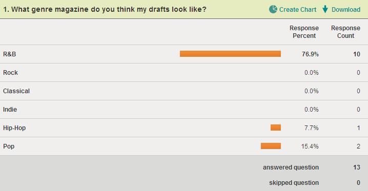


 These results tell me that my music magazine looks professional, which is again the approach I intended when I first started my research and planning.


