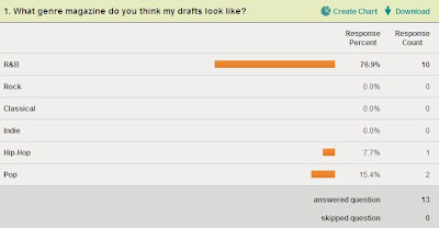
 The answers to this question confirmed that my music magazine is taking the appearance of the genre I intended, as most of the votes were for R&B or Pop, as I aimed my magazine to be a multi-genre magazine. Therefore, I won't need to make a lot of changes because of my magazine genre.
 Many people skipped this question, suggesting they didn't have any ideas for a new colour scheme or that they thought I didn't need to change my original colour scheme. However, I will experiment with the ideas of those that did answer.
 These results tell me that my types of images are appropriate for my magazines genre and target audience.
 These results tell me that my music magazine appears realistic, which is the approach I intended when I first started my research and planning.
 These results tell me that my music magazine looks professional, which is again the approach I intended when I first started my research and planning.
These results were similar to the previous question, but focussed on the contents page. Giving me ideas of other aspects to include, such as a subscription section, which I will experiment with in the making of my final magazine.
This question enabled me to see peoples general impression of my drafts, and the fact that they were mostly positive suggests that my drafts won't need too much work before the final.


No comments:
Post a Comment